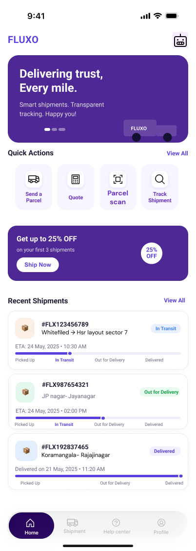
home base
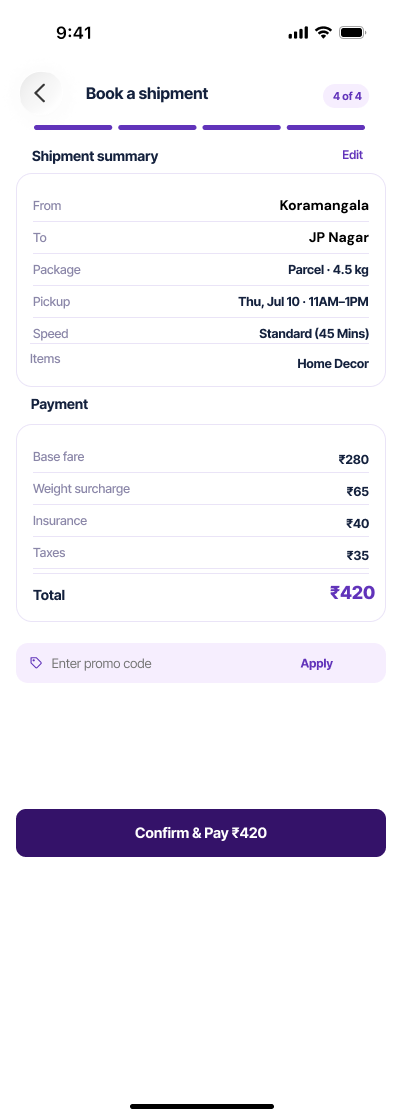
the send summary
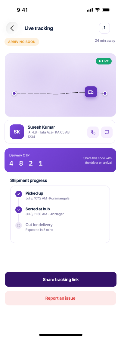
tracked live!
The same parcel app, rebuilt for iPhone in a deeper violet palette and native patterns: from the first launch to a scanned, verified, delivered parcel. All 27 screens are pinned below as userflow boards, and the reasoning lives in the full case study.
The same held beat as Android, retimed for iOS so the mark lands before the first tab loads.
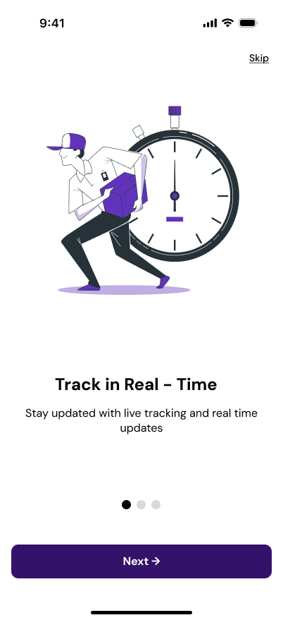
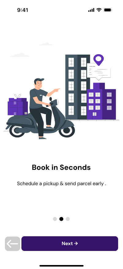
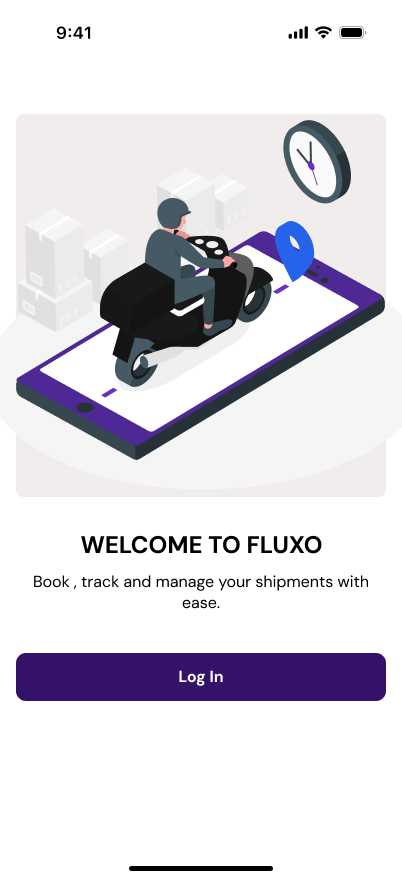
Three slides name the promise, live tracking, fast booking, safe handling, then a welcome screen hands off to sign-in.
Sign up, log in, and both recovery paths, phone and email, each with its own verification, so no one gets stranded at the entrance.
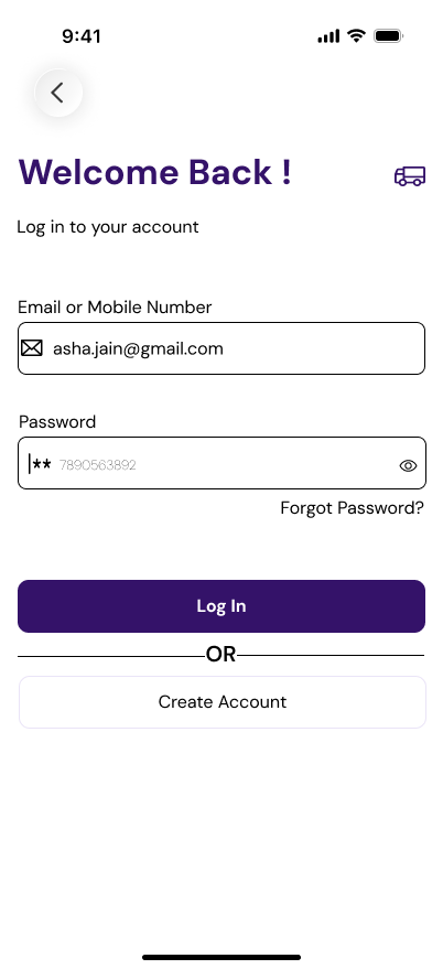
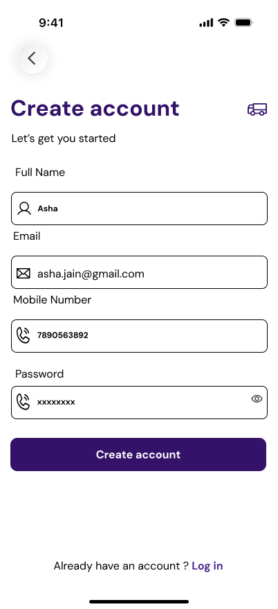
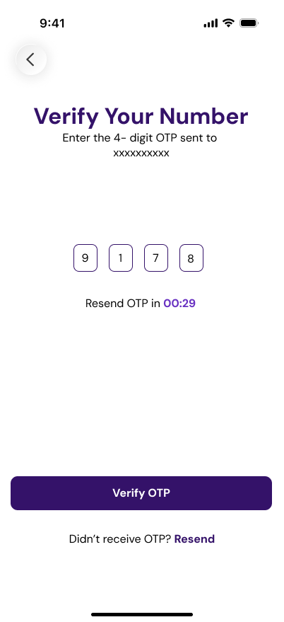
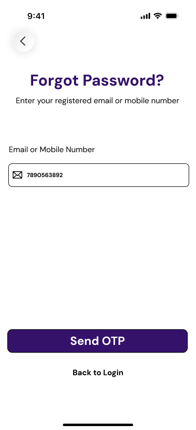
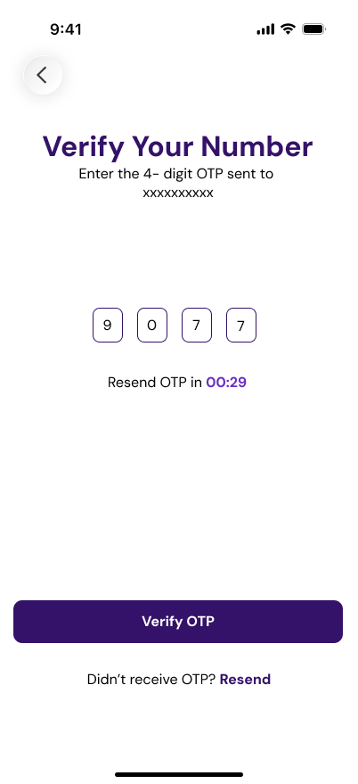
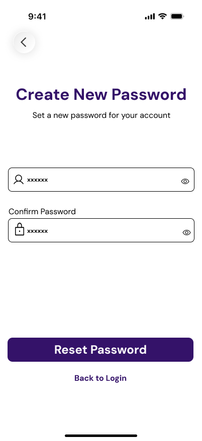
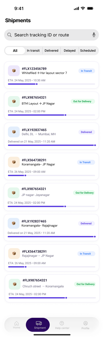
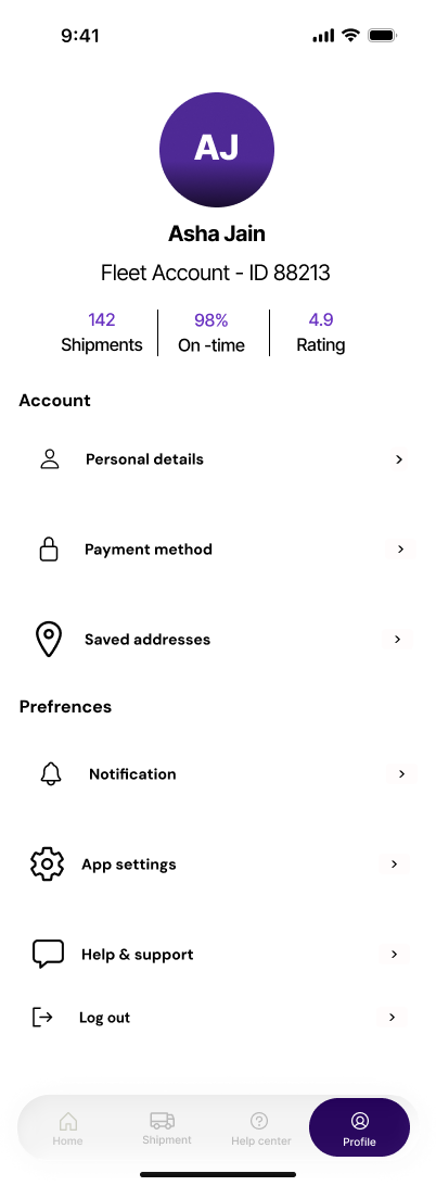
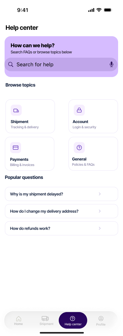
An iOS tab bar anchors the app: home with quick actions and recent shipments, the full shipments list, a profile, and a searchable help center.
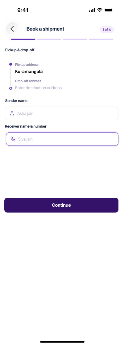
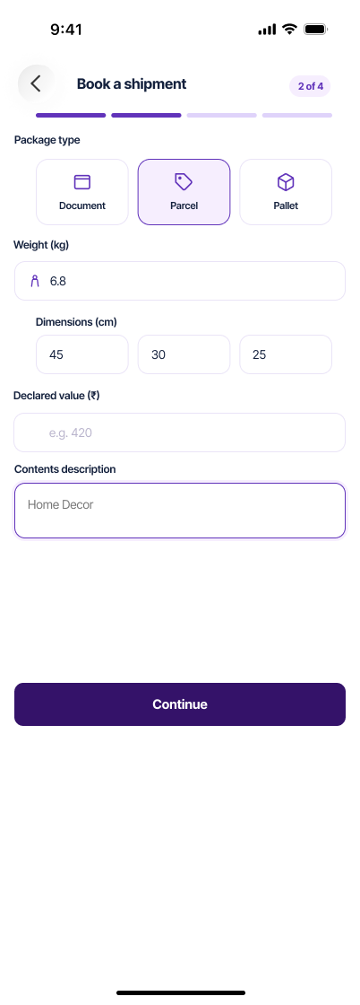
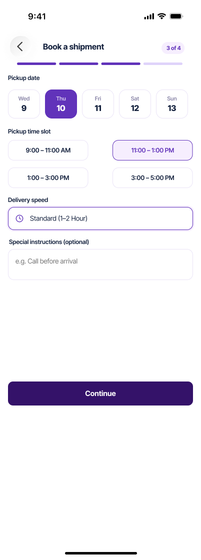
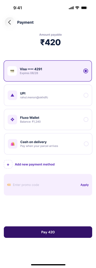
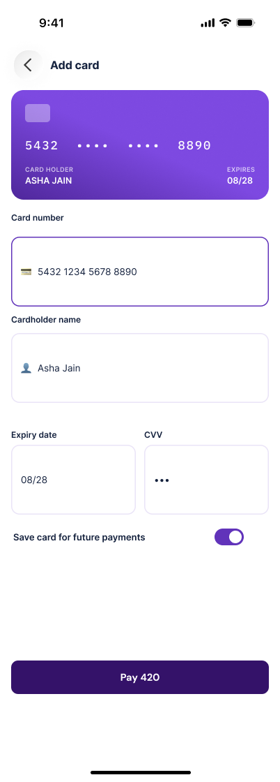
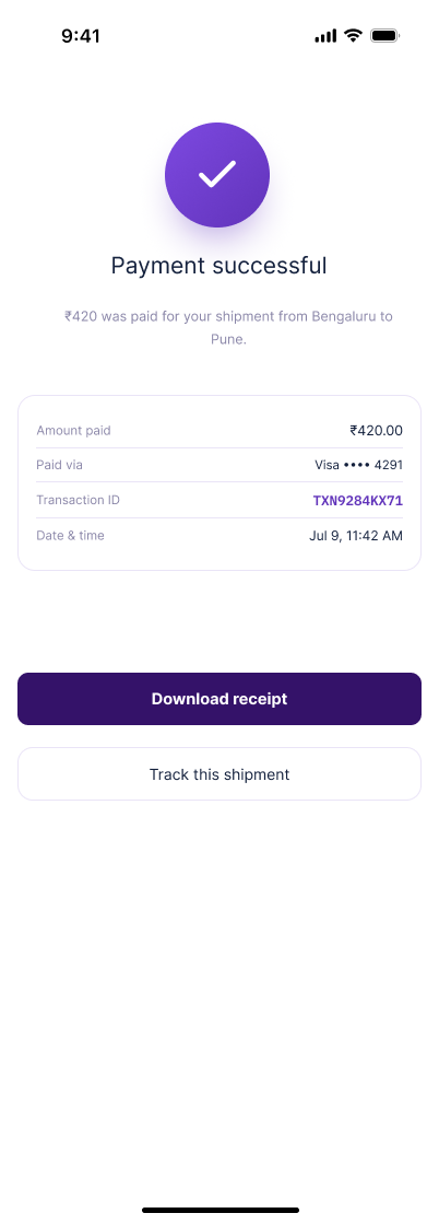
Sending a parcel runs pickup and drop-off, package type, time, then a summary before payment. Cutting the tap count through this flow drove the whole redesign.
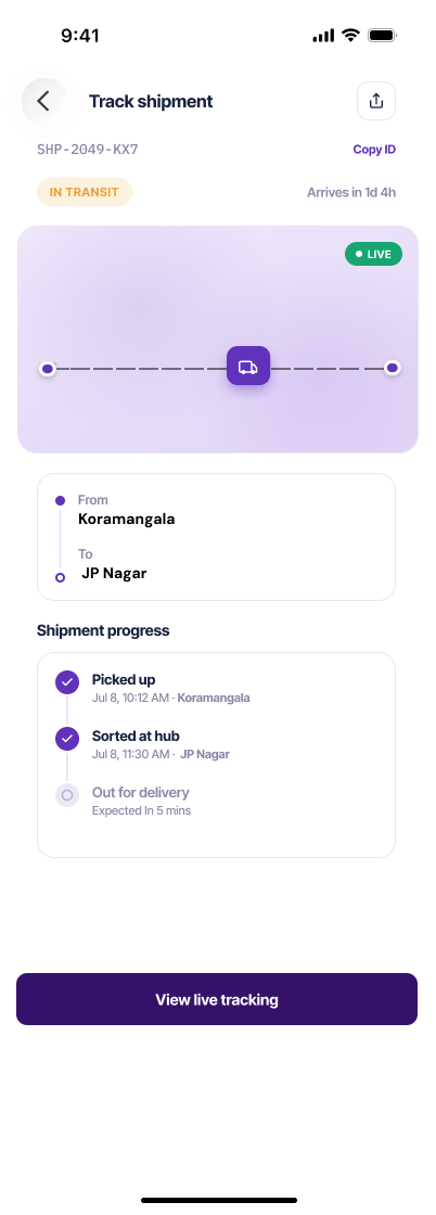
Once a parcel is moving, the map and a status timeline answer the only question that matters, with the driver and a delivery OTP surfaced together.
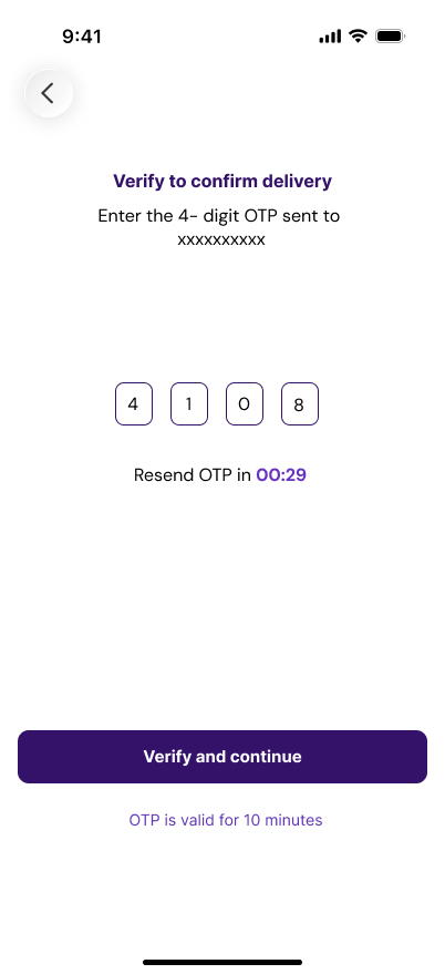
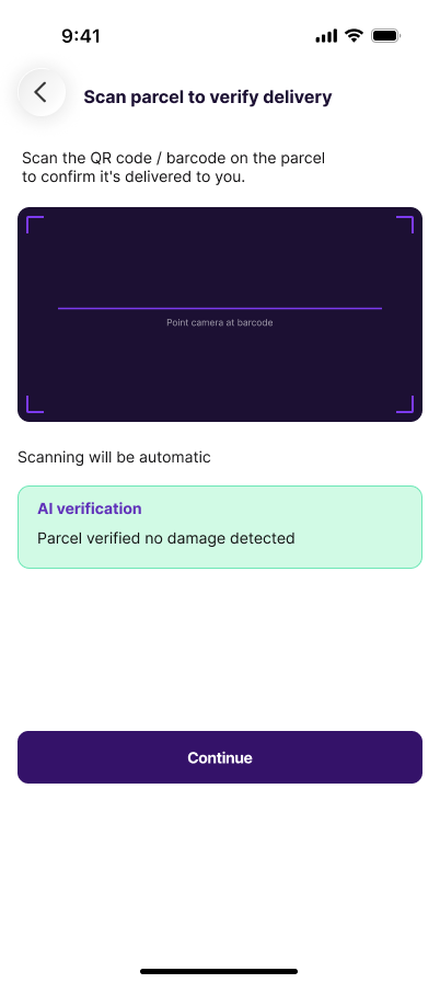
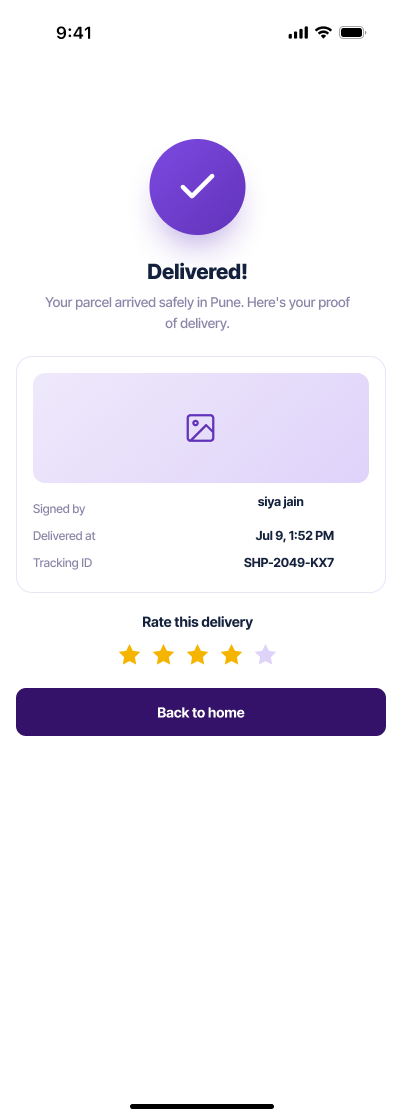
The iOS handoff leans on the camera: an OTP, then a QR scan that runs an on-device check for damage before a parcel can be marked delivered, then a rating.
518 coded reviews, nine interviews, a 41-card sort and six usability missions, one of which failed. The full case study covers what changed and what I got wrong.