A parcel app for India, walked through screen by screen: from the first launch to a rated, delivered parcel. Built in Material 3, riding the same flow that carried the full case study.
RoleSole designer, research to prototype
PlatformAndroid, Material 3
Built withFigma, FigJam
Screens28, across 7 flows
the three big moments ✧homesend a parcellive tracking
1
A brand moment on launch
hold that beat!1 screen
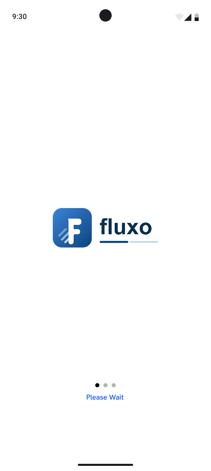
A held beat while the app wakes, so the first thing a new user sees is the mark, not a blank frame.
1
splash
2
Set expectations before sign-up
no effort asked yet4 screens
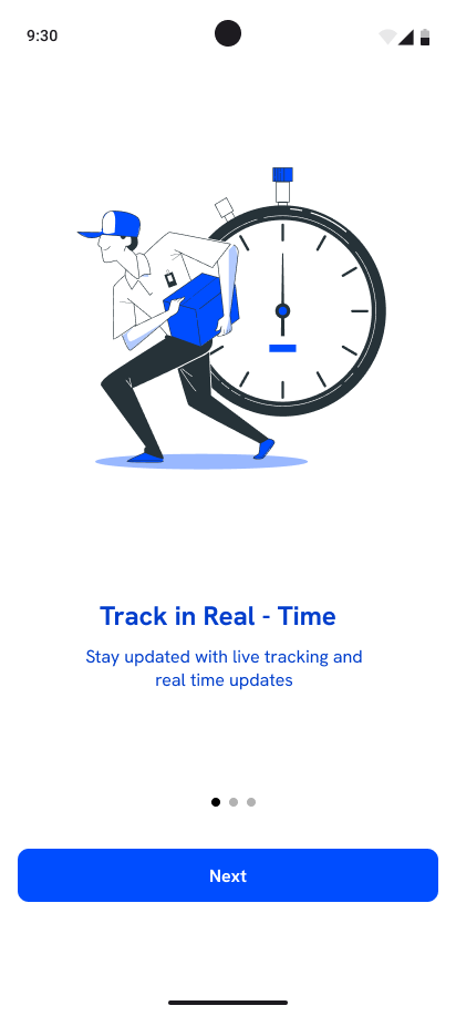
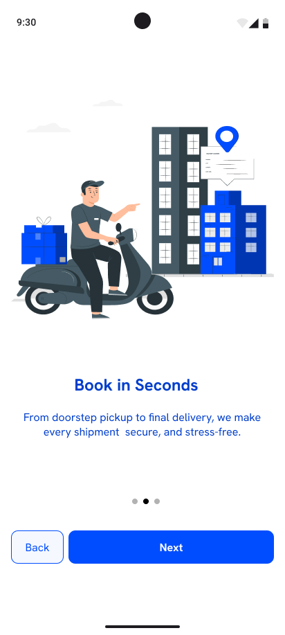
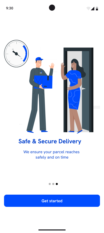
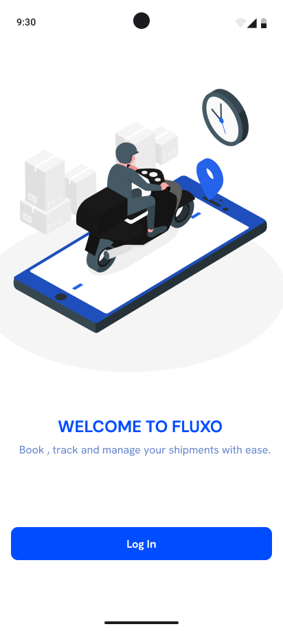
Three slides name the promise, live tracking, fast booking, safe handling, then hand off to a welcome screen. Nothing here asks the user to work.
1
track in real time
2
book in seconds
3
safe and secure
4
welcome!
3
Every door back in
no one gets stranded6 screens
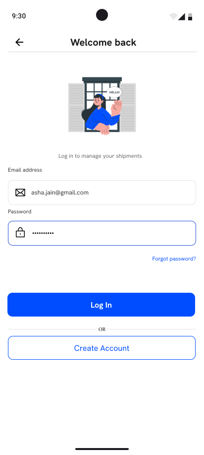
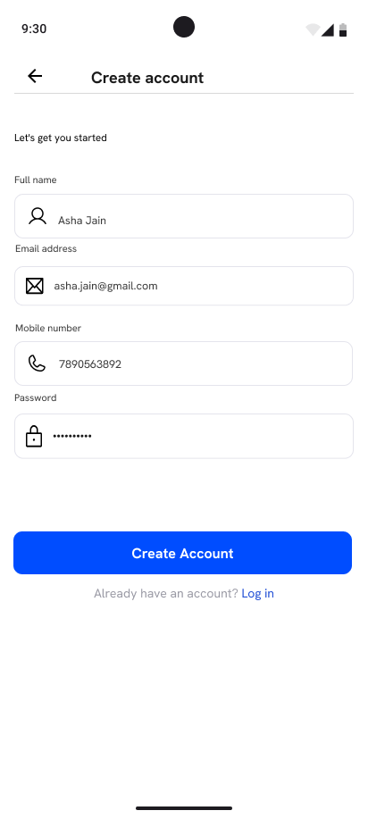
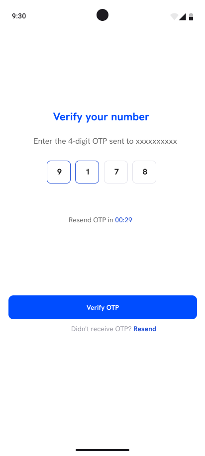
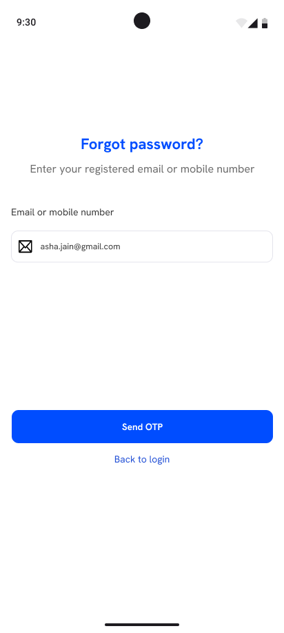
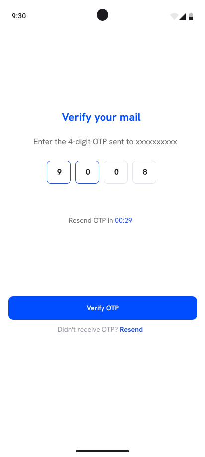
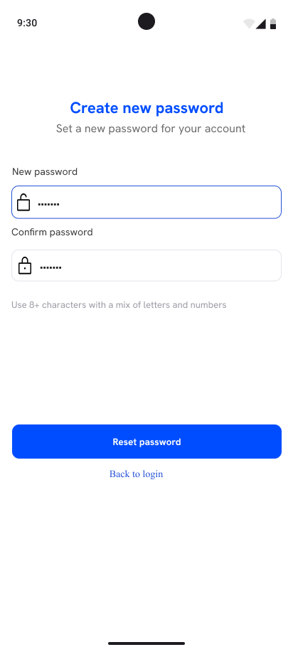
Sign up, log in, and both recovery paths, phone and email, each with its own verification. The aim was that no one gets stuck at the entrance.
scroll along the flow →
1
log in
2
create account
3
verify number
4
forgot password
5
verify email
6
new password
4
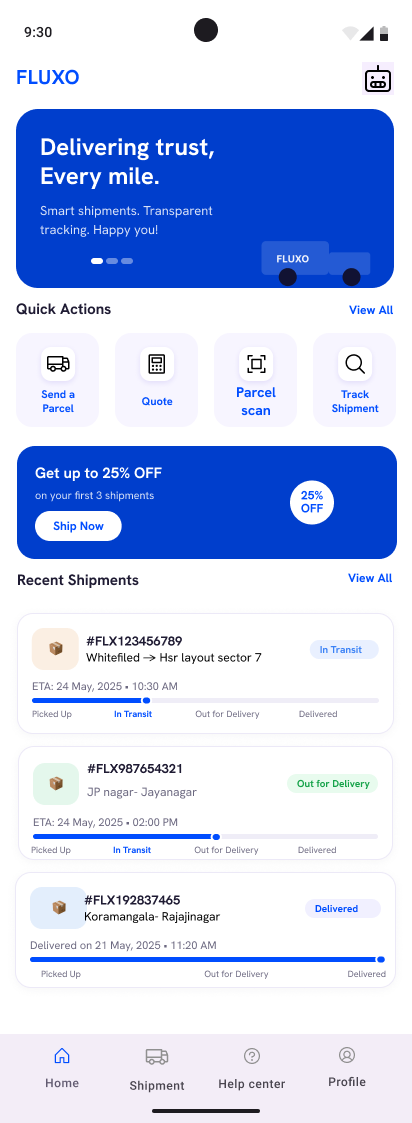
The base you come back to
quick actions up top4 screens
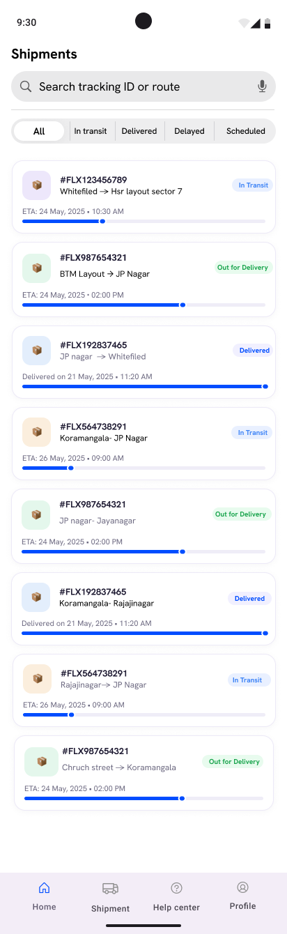
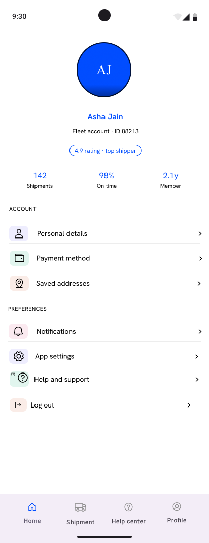
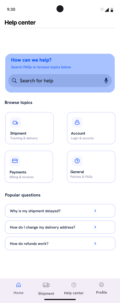
Quick actions and recent shipments up top, a full shipments list, a profile, and a searchable help center for when something goes sideways.
1
home
2
shipments
3
profile
4
help center
5
The core job, in four steps
fewer taps, the whole point!7 screens
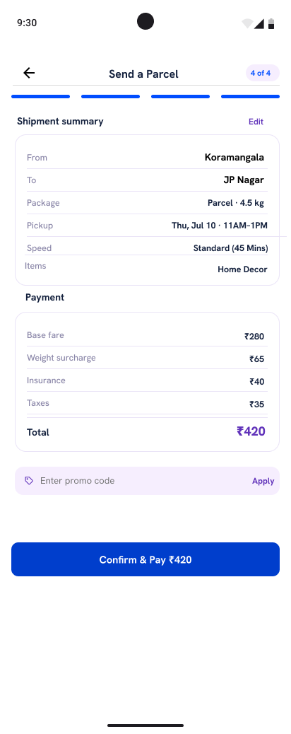
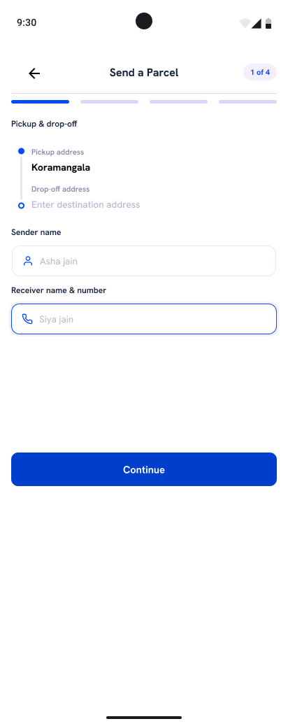
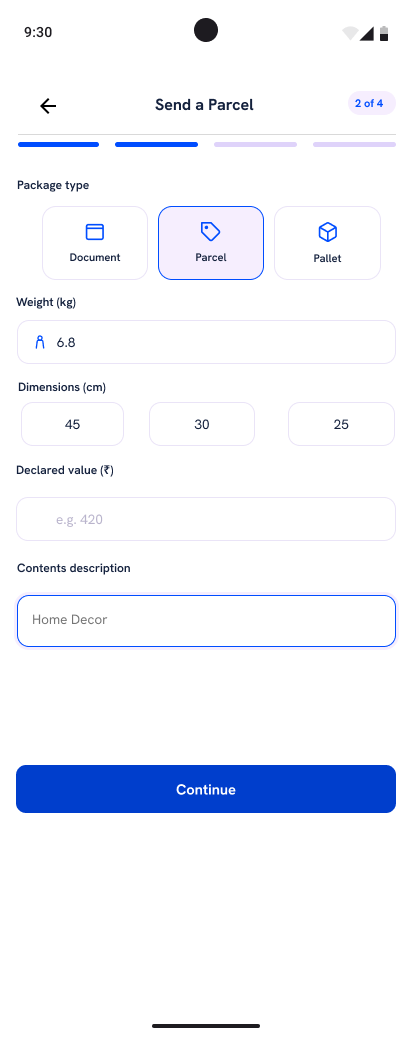
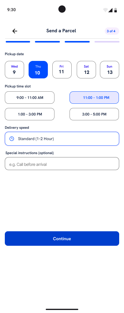
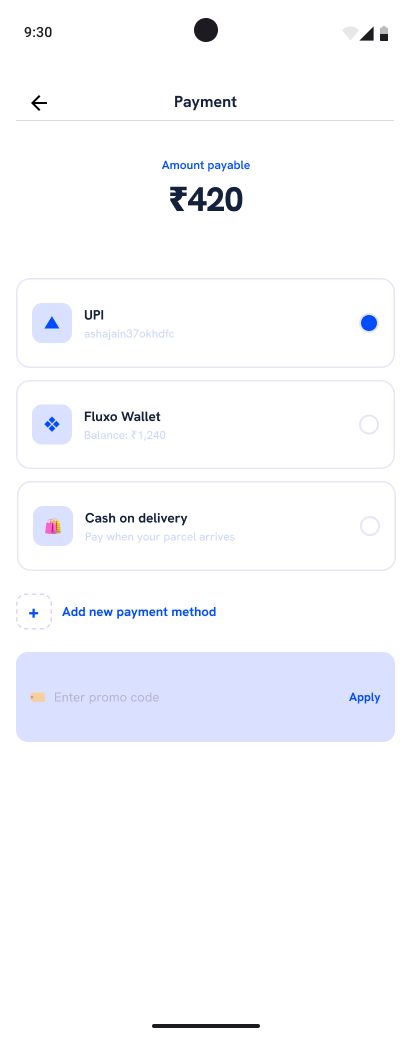
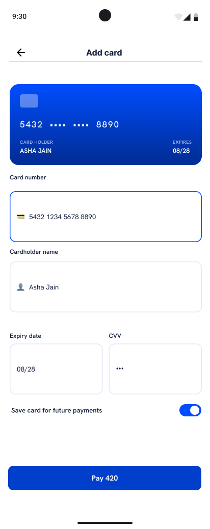
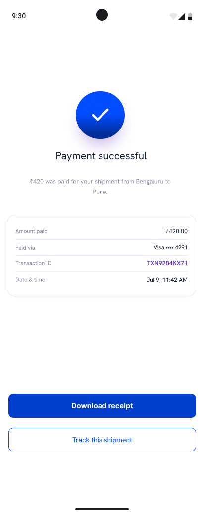
Sending a parcel runs pickup and drop-off, package type, time, then a summary before payment. Cutting the tap count through this flow drove the whole redesign.
scroll along the flow →
1
pickup and drop-off
2
package type
3
pickup time
4
summary
5
payment
6
add card
7
confirmed!
6
Where is it, answered
the only question that matters3 screens
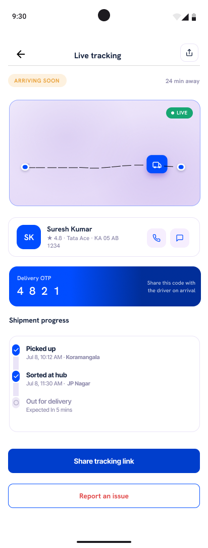
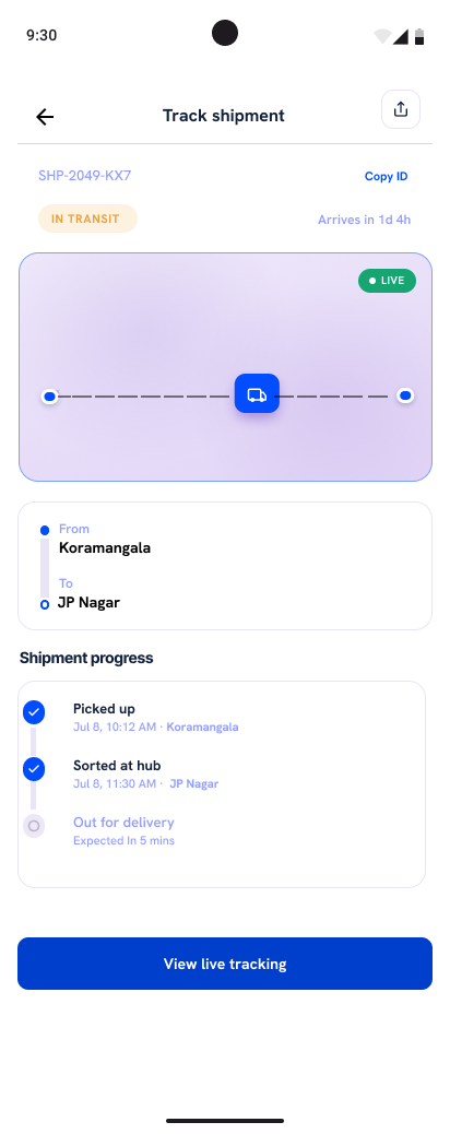
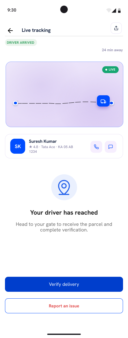
Once a parcel is moving, the map and a status timeline answer the only question that matters, with the driver surfacing as they get close.
1
track shipment
2
live tracking
3
driver arriving
7
Closing the loop
proof before "delivered"3 screens
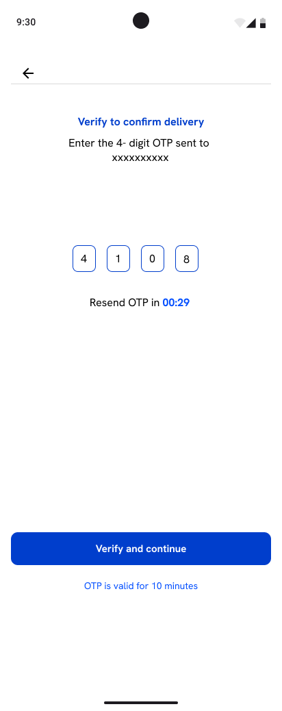
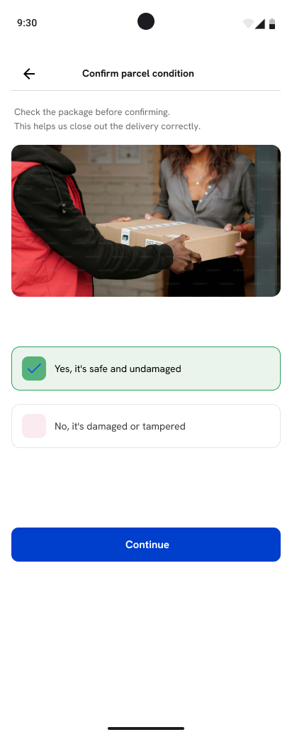
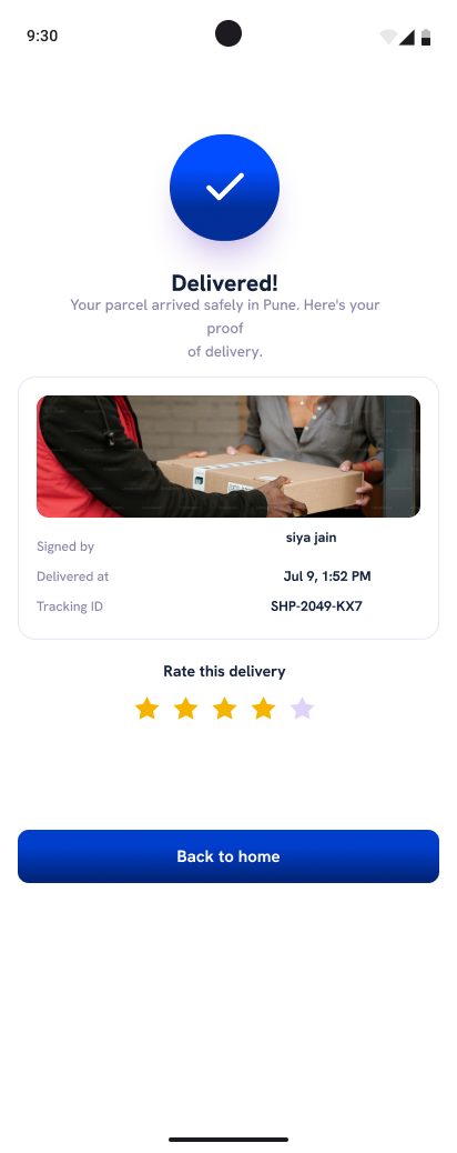
An OTP and a condition photo confirm the handoff, so a parcel cannot be marked delivered without proof, then a rating closes it out.
1
verify delivery
2
confirm condition
3
delivered and rated
so, where next?
The reasoning behind these screens
518 coded reviews, nine interviews, a 41-card sort and six usability missions, one of which failed. The full case study covers what changed and what I got wrong.